Geralis Honey
Meli Ikarias
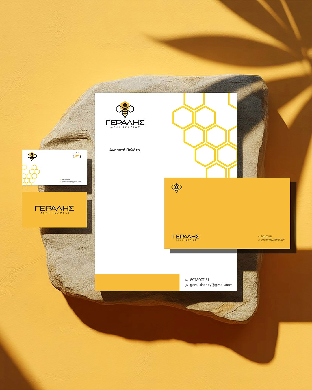
The project focuses on creating a distinctive visual identity that connects the brand with its natural origins and the character of Ikaria. The central element of the identity is a stylized bee, developed through geometric forms and integrated with the brand’s visual language. The logo combines the bee symbol with a clean, contemporary typographic approach, creating a visual identity that communicates both the natural character of the product and its modern positioning. Beyond the logo, I developed the complete brand identity for the business, including the typography, color palette, graphic elements and branded applications. The visual system was designed to remain consistent across different formats and touchpoints while maintaining a clear connection to the product’s origin.
Job
Brand Identity
Year
2024
Industry
Honey Business
Turnaround time
1 weeks

My approach
The identity was built around a geometric interpretation of the bee, combining a distinctive symbol with a contemporary typographic system and a warm, honey-inspired color palette.
The project covered the complete visual identity of the brand, including logo design, typography, color palette, graphic elements and brand applications.
A series of mockups demonstrates how the identity translates across different touchpoints while maintaining a consistent visual language.